We're Proud to Sponsor
The Women’s Health Innovation Summit in Boston Nov 4-6, 2025

More than 5.35 billion people are online, making up over 66% of the world’s population. Many of these users navigate various websites daily, but the real question is, are these websites accessible? Surprisingly, according to WebAIM, 96% of the top 1 million websites fail to meet accessibility standards. With such a high percentage of websites lacking accessibility, it’s clear that this oversight negatively impacts countless individuals with disabilities.
Nearly 30% of adults in the U.S. have a disability, and the number of people in an age group with a disability increases as the age range increases (older demographics have a higher rate of disability than younger demographics). Accessible design makes things better
for every user. It isn’t just about accommodations for users with disabilities. It’s about making a better product overall that considers the user first, and prioritizes their experience. Sidewalk ramps, remote controls, and automatic can openers are all examples of tools that assist people with mobility issues - but everyone can benefit from their ease of use. If you're not accessible to the 30% of adults in the US that have a disability, you're doing a disservice to millions of people every day. Plus, you're missing out on a huge opportunity for your business to reach more people.
You might be wondering, what makes a website accessible—or inaccessible? How can we contribute to web inclusivity? Accessible design ensures that individuals with various disabilities, such as visual, auditory, motor, and cognitive impairments, can navigate and interact with a website. This includes people who are blind or have low vision, those with hearing impairments, and individuals with limited mobility. With that in mind, creative teams must follow ADA (The Americans with Disabilities Act) guidelines to promote equal opportunities for everyone to access information and services. The following includes some of the most critical design tactics the Helen + Gertrude team uses to ensure accessibility on every web project.

Always design with a proper structure and hierarchy system: Proper heading tags include H1, H2, and more to organize and improve navigation time for screen readers. Pro tip: Partner with skilled developers who have a strong foundation in accessible code.
Design with a responsive layout so the website functions well across all devices, including smartphones and tablets. When designing responsive layouts, it’s important to consider adjusting button sizes to ensure users with motor impairments can tap accurately, especially on smaller screens. This functionality may be crucial depending on the target audience. For example, websites aimed at children or the elderly might need to make buttons slightly larger to improve usability.
Fast load times are not just a nice-to-have. Consider users who may not have a strong internet connection. Websites that are bogged down by large file sizes not only disrupt the user’s experience but may also leave your website unusable for them, causing a negative attitude toward your brand.

In 2024, we collaborated with The Child Advocacy Center of Greater Rochester, a non-profit organization dedicated to helping child abuse victims, to develop a brand new website. A key objective of the project was to create a site that was not only accessible to children but also safe and educational. Through our initial research, we found that children respond poorly to unnecessary complexity, especially when it makes it unclear what action they should take on a website or app. We also discovered that leveraging familiar design patterns from previous online experiences would help children navigate the site more easily. With these insights in mind, we focused on keeping the design simple, using branded color blocks to clearly separate information in a digestible way for both children and adults, and ensuring a consistent hierarchy throughout the site.
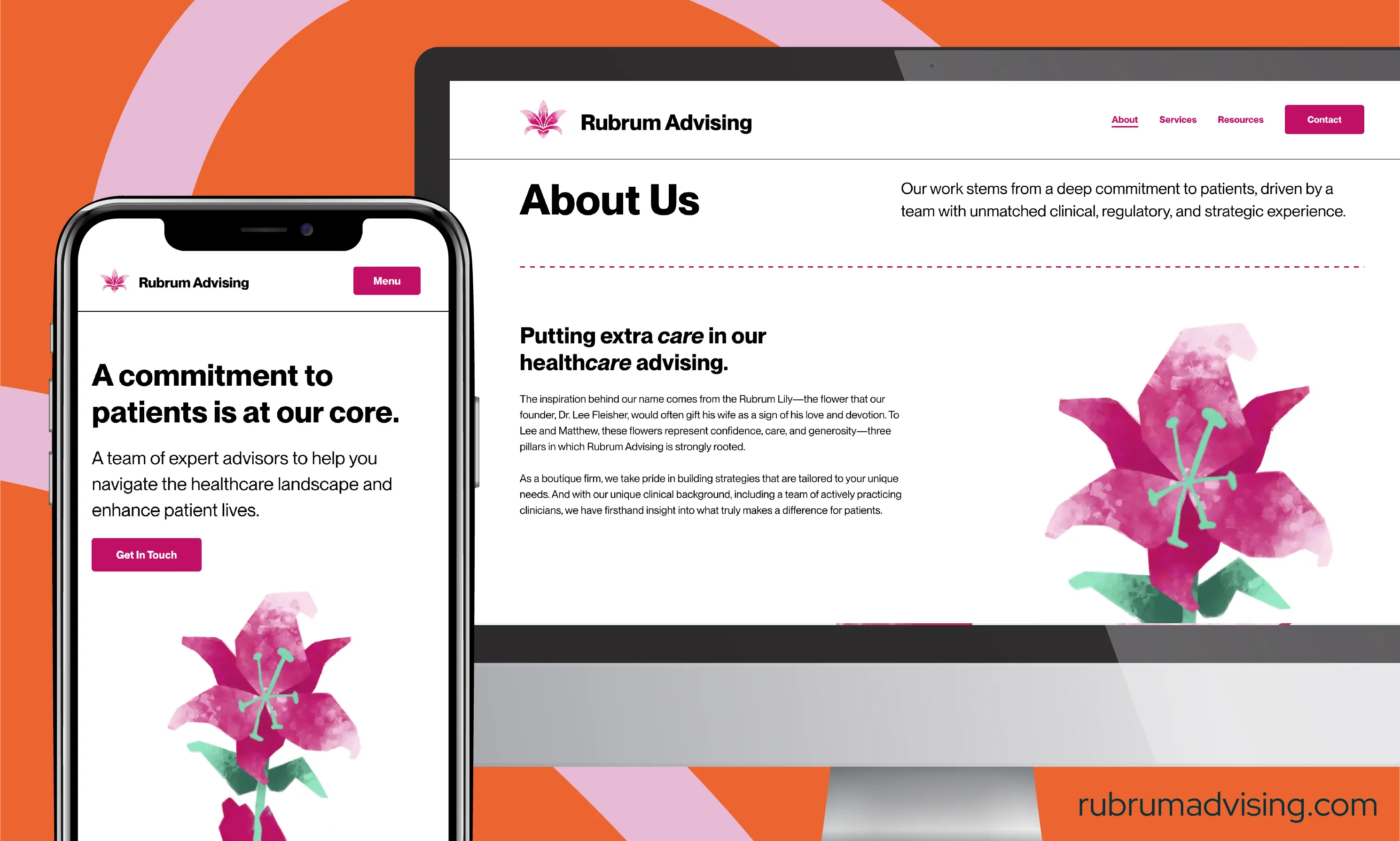
Our team also designed a new website for Rubrum Advising. The new site needed to incorporate prior brand elements, while starting from scratch on copy and design, with close client partnership. The brand’s core color was a light green, and we wanted to incorporate a pink, taking inspiration from the rubrum lily - the namesake of the medical advising company. Our designers worked to ensure that the developed red-green colors were still accessible for colorblind users according to the most recent WCAG standards. We also built accessible contact forms, a key component of the website’s goal of driving new leads. At the same time, our copywriting team worked closely with the client to take complex subject matter and create understandable, approachable copy that still gets to the heart of the content without losing key brand information.